ZookyZooky
TrueTypeUso personal
ZookyZooky.ttf
Etiquetas
Nota del autor
Setting type has been an occupation and a passion of mine over the last 30 years. After completing some schooling at Cooper School of Art in Downtown Cleveland I accepted a position at Peto's Type House. Back then, the Cleveland Press still set type with 'Hot' lead. I know, I know, this dates me, but the facts are the facts. PhotoType was in it's infancy with the Linotronic 5700 being top-of-the-line technology in Photo type setting. My job at Peto's was more modest, among other things, I was hired to set headline type on what was called a 'Typositor'. It was still photo type setting but for headlines only. Letters had to be set (exposed), one letter at a time. A single headline of lets say15 words or so could take an hour or two to completely finish for paste-up, that's right, I said paste-up. That should really date me!! By doing this day in and day out (for hours on end) I gained a "close-up' appreciation for letterforms and spacing. Ernie Peto would also quiz me on identifying type by name. It was an interesting 18 months to say the least. There have been lasting effects on my appreciation of letterforms thanks to this experience.
Over the years, there have been spin offs of wood type, Times Roman, Helvetica, etc. Seems to me like we are just going over the same ground over and over and over again. What interests me is not the 'sameness' in the letterforms or their 'invisibility' in the graphics world. Some fonts are used to be 'invisible'. What I mean by this is that they are merely a communication tool to deliver the authors' / writers' message. the artistry in the forms lies in their ability to stay invisible and be easy to read.
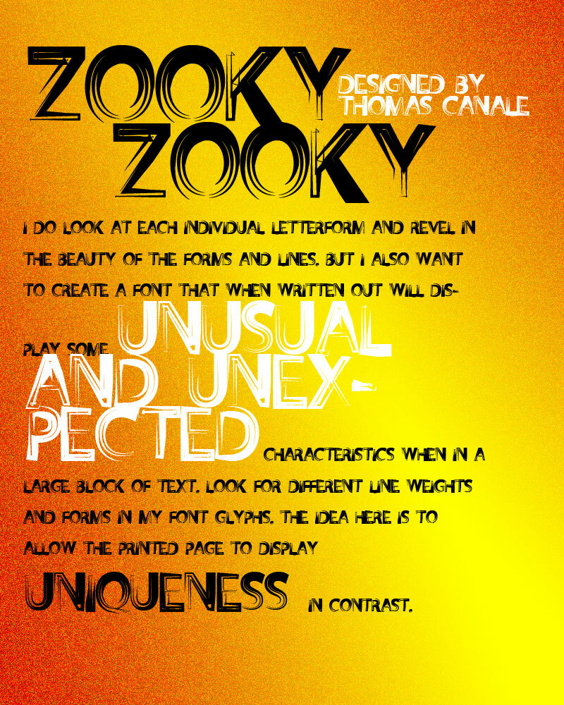
But their 'uniqueness' and how that difference translates to the printed page. There are many ways of looking at letterforms. We can look at the beauty of the individual letters themselves. Commenting on the curves of a upper case 'A' or a lower case letterform. Or we can look at them as a 'unit' and how that translates within a block of written text. It is this uniqueness that I am looking for in the fonts I design.
I do look at each individual letterform and revel in the beauty of the forms and lines. But I also want to create a Font that when written out will display some unusual and unexpected characteristics when in a large block of text. Look for different line weights and forms in my font glyphs. The idea here is to allow the printed page to display uniqueness in contrast.
Over the years, there have been spin offs of wood type, Times Roman, Helvetica, etc. Seems to me like we are just going over the same ground over and over and over again. What interests me is not the 'sameness' in the letterforms or their 'invisibility' in the graphics world. Some fonts are used to be 'invisible'. What I mean by this is that they are merely a communication tool to deliver the authors' / writers' message. the artistry in the forms lies in their ability to stay invisible and be easy to read.
But their 'uniqueness' and how that difference translates to the printed page. There are many ways of looking at letterforms. We can look at the beauty of the individual letters themselves. Commenting on the curves of a upper case 'A' or a lower case letterform. Or we can look at them as a 'unit' and how that translates within a block of written text. It is this uniqueness that I am looking for in the fonts I design.
I do look at each individual letterform and revel in the beauty of the forms and lines. But I also want to create a Font that when written out will display some unusual and unexpected characteristics when in a large block of text. Look for different line weights and forms in my font glyphs. The idea here is to allow the printed page to display uniqueness in contrast.
Mapa de caracteres
Por favor, usa el menú desplegable para ver los diferentes mapas de caracteres que contiene esta fuente.

Información básica de fuentes
Aviso de derechos de autor
©THOMAS CANALE, CANALE STUDIO, INC.
Familia de fuentes
ZookyZooky
Subfamilia de fuentes
ZookyZooky
Identificación de subfamilia única
1.000;pyrs;ZookyZooky
Nombre completo de fuente
ZookyZooky
Nombre de fuente PostScript
ZookyZooky
Fabricante
THOMAS CANALE
Diseñador
©THOMAS CANALE 2011
Descripción
Setting type has been an occupation and a passion of mine over the last 30 years. After completing some schooling at Cooper School of Art in Downtown Cleveland I accepted a position at Peto's Type House. Back then, the Cleveland Press still set type with 'Hot' lead. I know, I know, this dates me, but the facts are the facts. PhotoType was in it's infancy with the Linotronic 5700 being top-of-the-line technology in Photo type setting. My job at Peto's was more modest, among other things, I was hired to set headline type on what was called a 'Typositor'. It was still photo type setting but for headlines only. Letters had to be set (exposed), one letter at a time. A single headline of lets sayÉ15 words or so could take an hour or two to completely finish for paste-up, that's right, I said paste-up. That should really date me!! By doing this day in and day out (for hours on end) I gained a "close-up' appreciation for letterforms and spacing. Ernie Peto would also quiz me on identifying type by name. It was an interesting 18 months to say the least. There have been lasting effects on my appreciation of letterforms thanks to this experience.
Over the years, there have been spin offs of wood type, Times Roman, Helvetica, etc. Seems to me like we are just going over the same ground over and over and over again. What interests me is not the 'sameness' in the letterforms or their 'invisibility' in the graphics world. Some fonts are used to be 'invisible'. What I mean by this is that they are merely a communication tool to deliver the authors' / writers' message. the artistry in the forms lies in their ability to stay invisible and be easy to read.
But their 'uniqueness' and how that difference translates to the printed page. There are many ways of looking at letterforms. We can look at the beauty of the individual letters themselves. Commenting on the curves of a upper case 'A' or a lower case letterform. Or we can look at them as a 'unit' and how that translates within a block of written text. It is this uniqueness that I am looking for in the fonts I design.
I do look at each individual letterform and revel in the beauty of the forms and lines. But I also want to create a Font that when written out will display some unusual and unexpected characteristics when in a large block of text. Look for different line weights and forms in my font glyphs. The idea here is to allow the printed page to display uniqueness in contrast.
Información completa de la fuente
Información completa de la fuente
PlataformaCodificación
MicrosoftSólo unicode BMP
MacintoshRomano
UnicodeUnicode 2.0 y la semántica en adelante, unicode BMP sólo
Detalles de fuente
Creado2011-08-17
Revisión1
Conteo de Glifos101
Unidades por Em1000
Derechos de incrustaciónIncrustación para previsualización e impresión permitida
Clase de familiaSin clasificación
PesoMedia (normal)
AnchoMediana (normal)
Estilo MacNegrita
DirecciónSólo glifos muy de izquierda a derecha + contiene los neutrales
Naturaleza del patrónOrdinario
PitchNo monoespaciado