Wanders
OpenTypeGNU/GPL
- Acentos (parcial)
- Acentos (completo)
- Euro
Wanders.otf
Etiquetas
Nota del autor
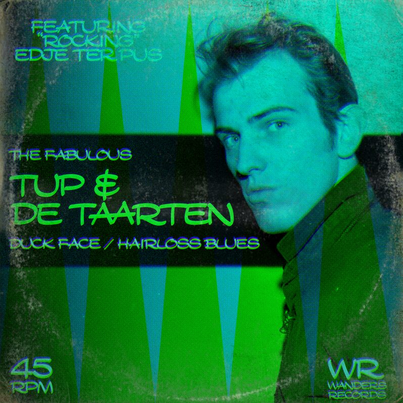
The Wanderers font will bring a fresh and exciting look to all of your projects. With its thick and sharp lines combined with the exaggerated curves and shapes, the Wanderers font is very similar to Walt Disney’s characters font and the styles used on cartoons from back in the day.
The striking features of the characters combined with the black color make this font visually effective to deliver a bold and strong message at a glance. This stylish handwritten font is available in OTF format.
You can add it to your poster, headline, or even print your company name on a cap! Make sure to follow Tup Wanders for more interesting free fonts.
--
Here's hoping that people will choose to use this font instead of my earlier font, Snickles, which I have come to dislike. :)
Mapa de caracteres
Por favor, usa el menú desplegable para ver los diferentes mapas de caracteres que contiene esta fuente.

Información básica de fuentes
Aviso de derechos de autor
Copyright Tup Wanders. All Rights Reserved.
Familia de fuentes
Wanders
Subfamilia de fuentes
Regular
Identificación de subfamilia única
Wanders:Version 1.00
Nombre completo de fuente
Wanders
Versión de la tabla de nombres
Version 1.00;November 25, 2024;FontCreator 11.5.0.2430 64-bit
Nombre de fuente PostScript
Wanders
Aviso de marca
nah
Fabricante
Diseñador
Descripción
Made by Tup Wanders using FontCreator 11.5 from High-Logic.com
Nou lief dagboek, dit is geloof ik al het vierde font dat ik in nde afgelopen weken maakte. Het hondje is inmiddels terug naar m'n moeder, ik kan weer lekker uitslapen.
Deze letter komt van mijn vader, ik heb hem als puber van hem gekopieerd. Maar zijn versie was wel veel krulleriger, een beetje zoals Walt Disney. Als je D-A-N typt krijg je zijn krullerige D als ligatuur. Gewoon een doorsnee stripletter. Niks bijzonders verder.
Nou dag hoor, tot de volgende letter
Tuppus
Información completa de la fuente
Información completa de la fuente
PlataformaCodificación
UnicodeUnicode 2.0 y la semántica en adelante, unicode BMP sólo
MacintoshRomano
MicrosoftSólo unicode BMP
Detalles de fuente
Creado2023-08-14
Revisión1
Conteo de Glifos398
Unidades por Em2048
Derechos de incrustaciónIncrustación para la instalación permanente
Clase de familiaManuscritos
PesoMedia (normal)
AnchoAmpliada
Estilo MacNegrita
DirecciónSólo glifos muy de izquierda a derecha
Naturaleza del patrónOrdinario
PitchNo monoespaciado