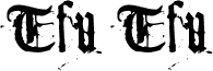
Tfu Tfu, de Meir Sadan, es una tipografía display blackletter gratuita con un toque medieval, contundente y desgastado. Sus letras se basan en formas góticas clásicas, pero los bordes desconchados y los cortes irregulares le quitan cualquier atisbo de formalidad; el resultado es rudo, manchado y un poco provocador.
Esto convierte a esta fuente gratuita en la elección natural para titulares de pósteres, portadas de fanzines, logotipos de bandas, tarjetas de título y cualquier packaging que busque un tono histórico oscuro sin llegar a ser pulcro u ornamental. Funciona mejor donde unas pocas palabras pueden lucir su textura, especialmente en titulares cortos o iniciales tipo monograma, ya que las formas blackletter maltratadas ya comunican gran parte del mensaje.
My kitty can make fonts. One day I was hanging around with my lovely kitty-cat, browsing different types of fonts. My kitty surprisingly started to stare at each typeface, examining its typographical correctness and structure, the serifs and the stroke angle. Suddenly, she meowed. It wasn't the regular kind of meow - it was her special meow. The meow she uses to greet people she likes... At that moment, it just hit my mind - my kitty happens to like Goudy's typeface.
Goudy is that font on the cover of The New York Times... The one that says "The New York Times". Yeah. Anyways... My kitty seemed to get all giddy and stuff, so I made a printout of it and let my kitty play with it.
In a very extreme measure of carefulness, she started toodling around with the font - scrach here, scratch there - wrinkle here, wrinkle there. She started to get bored from this routine quite fastly, so I took the poor piece of paper and rolled it to the shape of the ball. You should've seen the look of graditude on her face when she found out she could now both play and make a font at the same time!
To make a long story short, I eventually took the wad of material previously known as a piece of paper and scanned it into a font. And now you can have it. So there.
Información ampliada de la fuente
Plataformas compatibles
PlataformaCodificación
UnicodeUnicode 1.0 semántica
MacintoshRomano
MicrosoftSólo unicode BMP
Detalles de la fuente
Creada1998-12-16
Revisión1
Número de glifos102
Unidades por em1300
Permisos de incrustaciónIncrustación restringida (¡no permitido!)
Clase de familiaSin clasificación
GrosorMedia (normal)
AnchuraMediana (normal)
Tipo de anchuraNormal
Estilo MacNegrita
DirecciónSólo glifos muy de izquierda a derecha + contiene los neutrales