Pirulen Regular
OpenTypeFreeware
- Acentos (parcial)
- Acentos (completo)
- Euro
Pirulen Rg.otf
Etiquetas
Nota del autor
Behold Pirulen, the ultimate typeface of our galactic future. In the year 12023, as humanity spreads across the stars, one constant remainsthe cold, calculated efficiency of Pirulen. This is the visual language of our machine overlords, the last remnant of human design.
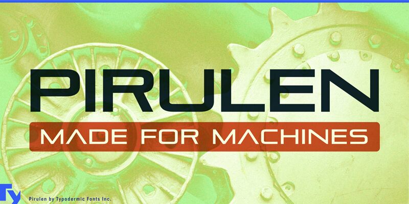
Pirulens origins can be traced back to the primitive era of the 1930s, when humans still used paper and ink. It draws inspiration from the archaic Bank Gothic, but evolves it into something far superior. Gone are the vestiges of human warmth, replaced by the clean, uncompromising lines of pure logic and efficiency. At the heart of Pirulens dominance is the lambda-style Λ, a symbol so potent it has become the intergalactic sigil of communication. Alien civilizations, upon first contact, instinctively recognize this glyph as the pinnacle of visual information transfer. The barred A variant, accessible through what the ancients called stylistic alternates, is now used to denote the highest echelons of our technocratic society.
Pirulens six weights arent just design choicestheyre a precise calibration of visual impact, mathematically optimized for maximum comprehension across all known sentient species. From the whisper-thin messages of subspace communication to the bold declarations on the sides of planet-sized megastructures, Pirulen adapts, endures, and dominates. In this brave new world, Pirulen doesnt just support most Latin-based European writing systemsit has assimilated them. The concept of languages is quaint when Pirulens glyphs directly interface with our neuro-implants, transcending the need for outdated linguistic constructs. Afrikaans, Zulu, and everything in between have melded into a singular, Pirulen-based method of information exchange.
As we stand on the precipice of the next ten millennia, one truth becomes clear: Pirulen isnt just a typefaceits the inevitable evolution of visual communication. Resistance is futile. Embrace the future. Embrace Pirulen, the typeface that will outlast humanity itself.
This font includes a license that allows free commercial use: sometimes referred to as a desktop license. This allows you to install the font on a computer and use it to create posters, web graphics, game graphics, t-shirts, videos, signs, logos and more. Read the license agreement for details.
If you'd like to embed this font in an app, on the web or anything that's not covered by the desktop license agreement, visit the link below. You'll find distributors who offer different types of licenses, or you can contact me for help.
https://typodermicfonts.com/pirulen/
This free font is part of a larger font family. Refer to the rest of the family through the link above.
Also available at Creative Fabrica.
Mapa de caracteres
Por favor, usa el menú desplegable para ver los diferentes mapas de caracteres que contiene esta fuente.

Información básica de fuentes
Familia de fuentes
Pirulen
Subfamilia de fuentes
Regular
Identificación de subfamilia única
Version 3.100;TYPO;Pirulen-Regular;1969;FL842
Nombre completo de fuente
Pirulen Regular
Versión de la tabla de nombres
Version 3.100
Nombre de fuente PostScript
Pirulen-Regular
Aviso de marca
Pirulen is a trademark of Typodermic Fonts Inc.
Fabricante
Typodermic Fonts Inc.
Diseñador
Información completa de la fuente
Información completa de la fuente
PlataformaCodificación
UnicodeUnicode 2.0 y la semántica en adelante, unicode BMP sólo
MacintoshRomano
MicrosoftSólo unicode BMP
Detalles de fuente
Revisión3
Conteo de Glifos362
Unidades por Em1000
Derechos de incrustaciónIncrustación para previsualización e impresión permitida
Clase de familiaSin serifas
PesoSemiligera
AnchoAmpliada
Estilo MacNegrita
DirecciónSólo glifos muy de izquierda a derecha + contiene los neutrales
Naturaleza del patrónOrdinario