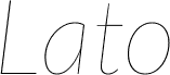
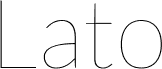
Lato Hairline Italic, designed by Lukasz Dziedzic for tyPoland, is a free hairline sans serif with a gentle rightward slant and exceptionally fine strokes. Broad curves and crisp diagonals keep the delicate drawing lively.
It can give fashion branding or a cultural event program an elegant contemporary voice for premium audiences, with enough warmth to avoid a cold, severely technical look. The sweeping curves and sharp angled forms also suit magazine covers, cosmetics packaging, and gallery posters, where the lettering can echo clean photography, fine rules, and spare geometric artwork.
Lato is a sanserif typeface family designed in the Summer 2010 by Warsaw-based designer Lukasz Dziedzic ("Lato" means "Summer" in Polish). It tries to carefully balance some potentially conflicting priorities: it should seem quite "transparent" when used in body text but would display some original traits when used in larger sizes. The classical proportions, particularly visible in the uppercase, give the letterforms familiar harmony and elegance. At the same time, its sleek sanserif look makes evident the fact that Lato was designed in 2010, even though it does not follow any current trend. The semi-rounded details of the letters give Lato a feeling of warmth, while the strong structure provides stability and seriousness.
Información ampliada de la fuente
Plataformas compatibles
PlataformaCodificación
UnicodeUnicode 2.0 y la semántica en adelante, unicode BMP sólo
MacintoshRomano
MicrosoftSólo unicode BMP
Detalles de la fuente
Creada2010-12-12
Revisión1
Número de glifos263
Unidades por em2000
Permisos de incrustaciónIncrustación para la instalación permanente
Clase de familiaSin serifas
GrosorMuy ligera
AnchuraMediana (normal)
Estilo MacSubrayar
DirecciónSólo glifos muy de izquierda a derecha + contiene los neutrales
Ángulo de cursiva-7
Naturaleza del patrónCursiva
EspaciadoNo monoespaciado
El paquete completo contiene los siguientes 10 estilos: