FaberSansPro-LeichtKursiv
TrueTypeUso personal
FaberSansPro46reduced.ttf
Etiquetas
Nota del autor
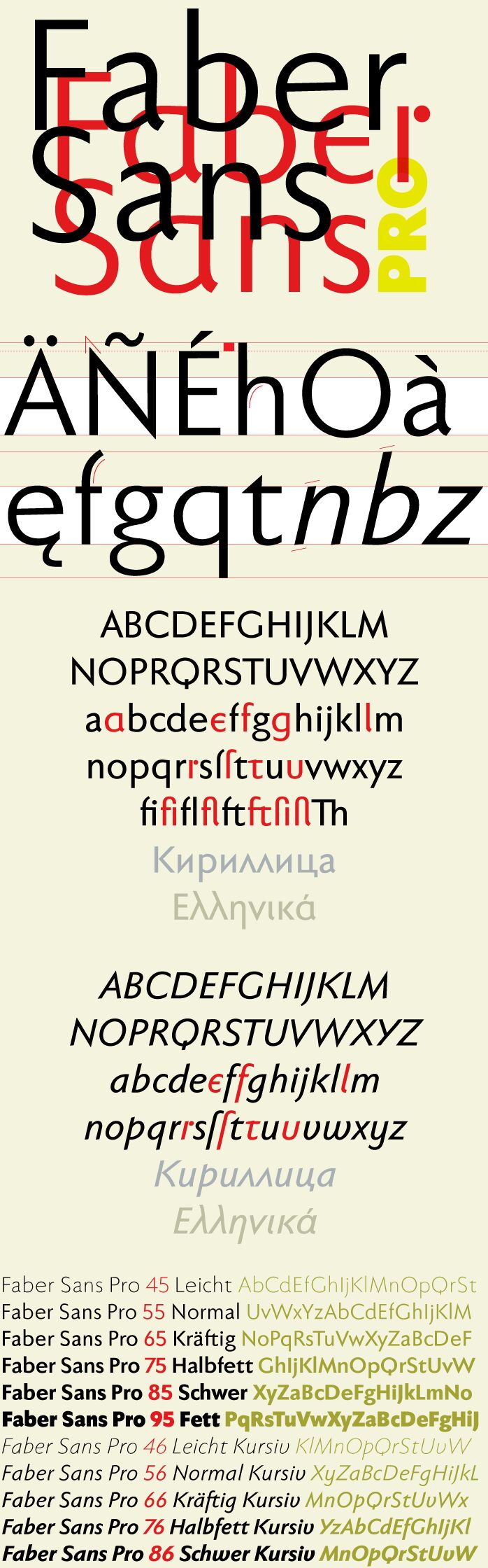
Two fonts in one: a classic-modern sans serif appearing in two forms "standard" and a "stylistic alternate" with uncial script-orientated characters which give the font a completely different "look."
The idea for one of the very first ingoFonts, the sans serif "Faber Eins & Zwei," originated in 1996. This typeface gained popularity over the years, especially in Anglo-Saxon countries. A lot has changed since then not just in font technology. In 2010 it was time for a basic revision of this attractive font, and time to bring it up to date with current font technology.
A uniqueness of Faber Sans Pro is that it is actually composed of two fonts. The "basic typeface" is a sans serif in the classic-modern style of type creations of the early 20th century godfathered by Futura from Paul Renner and Gill Sans from Eric Gill. The Roman Capitalis provided the model for the classically proportioned capital letters and the harmonic shapes of the humanistic minuscule for the lower case characters. And so a font with pleasant rhythmic proportions was created and is extremely comfortable to read, especially in large amounts of text; but, it is also reader-friendly under adverse typographic conditions on the monitor.
A "second" typeface with its own personal character resulted as stylistic alternates were designed for the letters a e f g l t u in accordance with the uncial scripts of the late antiquity or rather the early Middle Ages. And the r is given a playful point in the stylistic alternates. Modern OpenType technology makes it possible to combine the previously separate typefaces into one font. The stylistic alternate can be accessed via the OpenType-Functions Discretionary Ligatures or also Stylistic Alternates (and of course the glyph panel).
Unlike classic sans serifs, Faber Sans Pro includes a "true" italic. The italic characters are not simply just slanted variations of the upright, but the characters originated out of handwriting styles; they are rounder and the stroke flow is more fluent than on the upright letters. Some italic letters truly have their very own design which clearly comes from handwriting, particularly noticeable on a and g.
At ingoFonts all fonts can be downloaded. Gratis. Free.
Here's the catch: The files offered here to download contain only a reduced font. That means, the font only consists of uppercase and lowercase from A to Z or rather, a to z.
The complete font including numerals, umlauts, punctuation and especially ligatures is only available with your order and your cash.
Mapa de caracteres
Por favor, usa el menú desplegable para ver los diferentes mapas de caracteres que contiene esta fuente.

Información básica de fuentes
Aviso de derechos de autor
Copyright (c) 2010 by Ingo Zimmermann ingoFont Augsburg. All rights reserved.
Familia de fuentes
Faber Sans Pro reduced
Subfamilia de fuentes
46 Leicht Kursiv
Identificación de subfamilia única
IngoZimmermanningoFontAugsburg: Faber Sans Pro 46 Leicht Kursiv: 2010
Nombre completo de fuente
FaberSansPro-LeichtKursiv
Versión de la tabla de nombres
Version 4.013
Nombre de fuente PostScript
FaberSansPro-LeichtKursiv
Aviso de marca
Faber Sans Pro 46 Leicht Kursiv is a trademark of Ingo Zimmermann ingoFont Augsburg.
Fabricante
Diseñador
Descripción
Copyright (c) 2010 by Ingo Zimmermann ingoFont Augsburg. Reviewed. All rights reserved.
Información completa de la fuente
Información completa de la fuente
PlataformaCodificación
UnicodeUnicode 2.0 y la semántica en adelante, unicode BMP sólo
MacintoshRomano
MicrosoftSólo unicode BMP
Detalles de fuente
Creado2010-10-23
Revisión4
Conteo de Glifos53
Unidades por Em1000
Derechos de incrustaciónIncrustación para la instalación permanente
Clase de familiaSin serifas
PesoLigera
AnchoMediana (normal)
Estilo MacSubrayar
DirecciónSólo glifos muy de izquierda a derecha + contiene los neutrales
Naturaleza del patrónCursiva
PitchNo monoespaciado