Em One SemiBold Italic
TrueTypeFreeware
- Acentos (parcial)
- Acentos (completo)
- Euro
EmOne-SemiBoldItalic.ttf
Etiquetas
Nota del autor
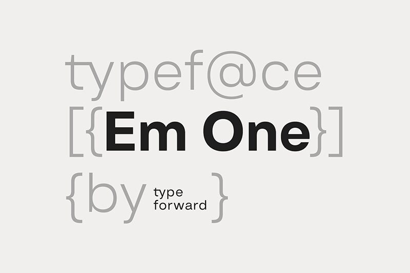
Em One SemiBold Italic font designed by Type Forward Foundry is a clean and minimalistic sans-serif. This modern typeface balances simple aesthetics with a high x-height allowing it to be compact and visually appealing. The font has moderate proportions with minimal contrasts making it both functional and timeless in character. Interested users can have this font for free.
With its versatile style, Em One SemiBold Italic is perfectly handy for websites, apps, magazines, books, journals, brochures, advertisements, environmental graphics, corporate identities, office communications like emails or letters em headings or body text alike.
--
Get the full font:
https://www.typeforward.com/typefaces/em-one
Design Approach:
Em One is the first typeface developed in collaboration with our colleague Luboslav Boyanov, a graduate of the National Academy of Art Sofia. Our aim was to create a functional typeface with a broad range of applications, including web and print, branding, editorial design, and various other contexts. This typeface embodies the distinctive character and aesthetics of classic Swiss design while maintaining a straightforward appearance.
Distinct Features:
Key features of Em One include a tall x-height, minimal contrast between strokes, and moderate proportions that enhance readability. Refined letter spacing contributes to its overall appeal, while unique elements in certain letters add character without introducing excessive visual noise. This makes Em One versatile and well-balanced between functionality and graphic identity.
Font Family Composition:
Em One consists of 9 weights ranging from Thin to Black, each with a corresponding italic version. It is available in refined OTF, TTF, and web font formats. Additionally, a variable font format offers greater flexibility for dynamic design solutions.
Technical Specifications:
Designed for a diverse audience, Em One supports over 220 languages including Extended Latin and Cyrillic characters. It incorporates numerous typographic features such as ligatures, stylistic sets, contextual alternatives, and OpenType functionalities.
Usage:
Em One is multifunctional and adaptable; the various weights can serve as standalone elements or be integrated into cohesive design systems. Thicker and thinner weights are ideal for headlines and display use while middleweights are optimized for text blocks. Specifically optimized for screens, Em One performs well across media formats by balancing glyphs with negative space for effective print use.
Summary:
Em One is a practical sans-serif typeface influenced by popular Swiss designs from the mid-20th century. Built as a multipurpose font, it excels in both display graphics and functional contexts while remaining recognizable and characterful.
Mapa de caracteres
Por favor, usa el menú desplegable para ver los diferentes mapas de caracteres que contiene esta fuente.

Información básica de fuentes
Familia de fuentes
Em One SemiBold
Subfamilia de fuentes
Italic
Identificación de subfamilia única
1.000;SPT;EmOne-SemiBoldItalic
Nombre completo de fuente
Em One SemiBold Italic
Versión de la tabla de nombres
Version 1.000
Nombre de fuente PostScript
EmOne-SemiBoldItalic
Fabricante
Diseñador
Descripción
Geometric Typeface
Información completa de la fuente
Información completa de la fuente
PlataformaCodificación
UnicodeUnicode 2.0 y la semántica en adelante, unicode BMP sólo
MicrosoftSólo unicode BMP
Detalles de fuente
Creado2024-08-23
Revisión1
Conteo de Glifos609
Unidades por Em1000
Derechos de incrustaciónIncrustación para previsualización e impresión permitida
Clase de familiaSin serifas
PesoSeminegrita
AnchoMediana (normal)
Estilo MacSubrayar
DirecciónSólo glifos muy de izquierda a derecha + contiene los neutrales
Naturaleza del patrónCursiva
PitchNo monoespaciado
El paquete completo contiene 2 los pesos de fuentes enlistados abajo:
EmOne-SemiBoldItalic.ttf
EmOne-SemiBold.ttf
EmOne-SemiBold.ttf
Em One SemiBold
TrueTypeFreeware
