Best Choice Demo Regular
OpenTypeDemo
- Acentos (parcial)
- Acentos (completo)
- Euro
BestChoiceDemo-Regular.otf
Etiquetas
Nota del autor
1.
This is a demo version.
To use this for commercial or personal use, please visit
https://www.myfonts.com/fonts/flat-it/best-choice/
2.
Best Choice supports Vietnamese.
I am looking forward to feedback from Vietnamese people.
3.
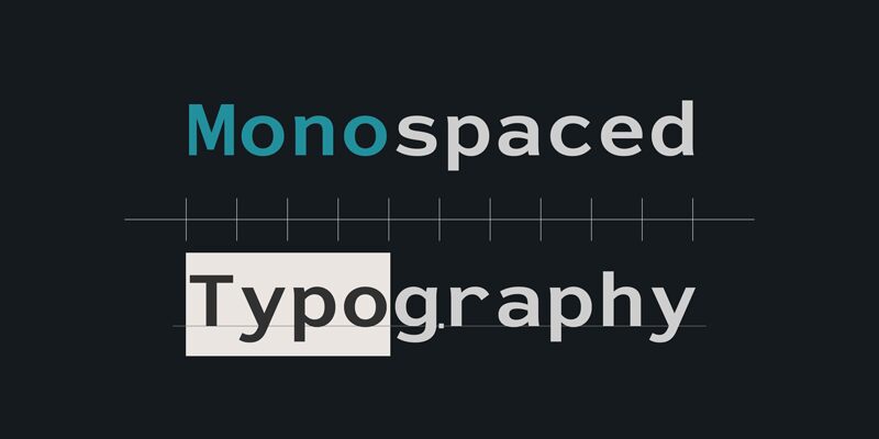
Best Choice is a family of next-generation monospaced fonts for developing, programming, coding, and table layout.
Some desirable features in monospaced fonts are listed below.
1.Easy to distinguish
2.Easy to identify
3.Easy to read
Best Choice has very distinguishing letterforms for confusable letters such as Zero&Oh, One&I, and Two&Z. A lot of ingenuity makes this family very distinguishable.
Italics have a very large inclination angle to be distinguished from their Roman. For the same reason, Italics are slightly lighter than Romans.
Italic is not cursive Italic. It is near the slanted Roman.
This is an intentional design to identify Italic letters.
Cursive is not suitable for programming font.
Very clean and natural letterform is good for reading.
Common curvature for tails and hooks makes harmony and a sense of unity.
Best Choice supports almost all Latin including Vietnamese and Cyrillic.
Try this all-new experiment.
This is a demo version.
To use this for commercial or personal use, please visit
https://www.myfonts.com/fonts/flat-it/best-choice/
2.
Best Choice supports Vietnamese.
I am looking forward to feedback from Vietnamese people.
3.
Best Choice is a family of next-generation monospaced fonts for developing, programming, coding, and table layout.
Some desirable features in monospaced fonts are listed below.
1.Easy to distinguish
2.Easy to identify
3.Easy to read
Best Choice has very distinguishing letterforms for confusable letters such as Zero&Oh, One&I, and Two&Z. A lot of ingenuity makes this family very distinguishable.
Italics have a very large inclination angle to be distinguished from their Roman. For the same reason, Italics are slightly lighter than Romans.
Italic is not cursive Italic. It is near the slanted Roman.
This is an intentional design to identify Italic letters.
Cursive is not suitable for programming font.
Very clean and natural letterform is good for reading.
Common curvature for tails and hooks makes harmony and a sense of unity.
Best Choice supports almost all Latin including Vietnamese and Cyrillic.
Try this all-new experiment.
Mapa de caracteres
Por favor, usa el menú desplegable para ver los diferentes mapas de caracteres que contiene esta fuente.

Información básica de fuentes
Familia de fuentes
Best Choice Demo
Subfamilia de fuentes
Regular
Identificación de subfamilia única
1.000;DHRM;BestChoiceDemo-Regular
Nombre completo de fuente
Best Choice Demo Regular
Versión de la tabla de nombres
Version 1.000;hotconv 1.0.109;makeotfexe 2.5.65596
Nombre de fuente PostScript
BestChoiceDemo-Regular
Aviso de marca
Best Choise is a trademark of Dharma Type Inc.
Fabricante
Diseñador
Descripción
Designed by Ryoichi Tsunekawa from Dharma Type Inc. in 2021.
Información completa de la fuente
Información completa de la fuente
PlataformaCodificación
UnicodeUnicode 2.0 y la semántica en adelante, unicode BMP sólo
MicrosoftSólo unicode BMP
Detalles de fuente
Creado2021-05-07
Revisión1
Conteo de Glifos650
Unidades por Em1000
Derechos de incrustaciónIncrustación para la instalación permanente
Clase de familiaSin serifas
PesoSemiligera
AnchoSemiampliada
Estilo MacNegrita
DirecciónSólo glifos muy de izquierda a derecha + contiene los neutrales
Naturaleza del patrónOrdinario