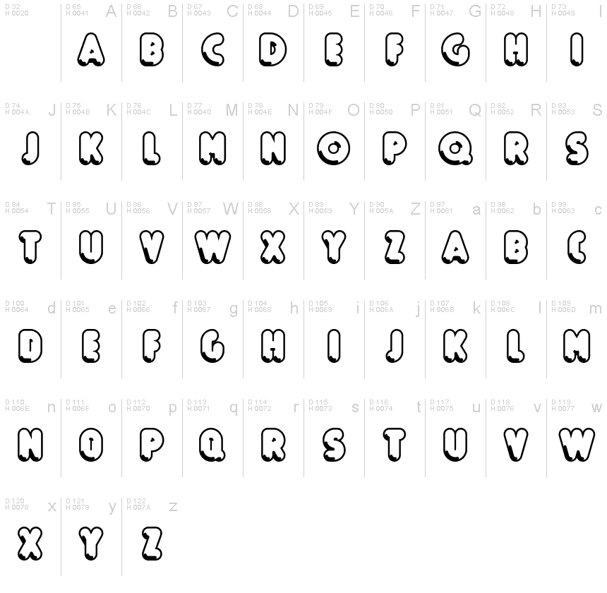
Boule Reduced Contour
TrueTypeUso personal
BouleReduced-Contour.ttf
Etiquetas
Nota del autor
Boule Reduced Contour font is a cool groovy typeface designed by ingoFont.
BOULE
Capitalized, GEOMETRIC, bold and ROUND.
If the typographer sees a font like that, it's enough to make his toes curl. But sometimes it just has to be that way.
Geometrically constructed fonts do not necessarily have to be pointed and angular; It also works consistently around. And if I say it consistently, then in this case, that's done consistently.
The basis for the BOULE is the circle. The letters are drawn with constant line width, the corners and endings all have the same radius, the lines are all the same thickness.
The BOULE consists only of capitals. There is only one difference in the use of uppercase and lowercase letters: in the uppercase letters, the round letters are circular, while the lowercase letters are narrow.
The Boule is not only very fat, it also runs very tight; that is, the glyphs are very close to each other. To avoid "holes" due to unfortunate letter combinations, the Boule contains ligatures for FT, ST, TT and TZ.
There are also other versions of the font: Boule Brillant on the one hand. In this version, simple highlights simulate a light incidence from the top right. These light edges give the font a decorative effect that makes it easy to think of wet sausages or balloons in some shapes.
And finally the Boule Contour. As the name implies, it is the outer contour of the letters, combined with a shadow at the bottom left.
The name Boule (French for ball) says it already: this font is globated. Therefore, it is also very suitable for all three-dimensional alienation effects. With simple light and shadow you can achieve a very convincing 3D effect with little effort.
Mapa de caracteres
Por favor, usa el menú desplegable para ver los diferentes mapas de caracteres que contiene esta fuente.

Información básica de fuentes
Aviso de derechos de autor
Copyright (c) 2019 by Ingo Zimmermann. Alle Rechte vorbehalten.
Familia de fuentes
Boule Reduced
Subfamilia de fuentes
Contour
Identificación de subfamilia única
IngoZimmermann: Boule Reduced Contour: 2019
Nombre completo de fuente
Boule Reduced Contour
Versión de la tabla de nombres
Version 1.015
Nombre de fuente PostScript
BouleReduced-Contour
Aviso de marca
Boule Reduced Contour ist eine Marke von Ingo Zimmermann.
Fabricante
Diseñador
Descripción
Copyright (c) 2019 by Ingo Zimmermann. All rights reserved.
Información completa de la fuente
Información completa de la fuente
PlataformaCodificación
UnicodeUnicode 2.0 y la semántica en adelante, unicode BMP sólo
MacintoshRomano
MicrosoftSólo unicode BMP
Detalles de fuente
Creado2019-04-20
Revisión1
Conteo de Glifos54
Unidades por Em1000
Derechos de incrustaciónIncrustación para la instalación permanente
Clase de familiaSin clasificación
PesoMuy negrita
AnchoCondensada
Estilo MacCursiva
DirecciónSólo glifos muy de izquierda a derecha + contiene los neutrales
Naturaleza del patrónEsbozo
PitchNo monoespaciado
El paquete completo contiene 3 los pesos de fuentes enlistados abajo:
BouleReduced-Contour.ttf
BouleReduced-Brillant.ttf
BouleReduced-Gras.ttf
BouleReduced-Brillant.ttf
BouleReduced-Gras.ttf
Boule Reduced Brillant
TrueTypeUso personal
Boule Reduced Gras
TrueTypeUso personal
